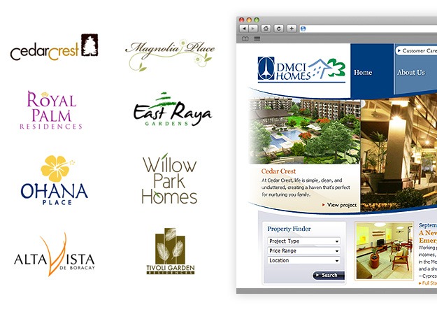
DMCI Homes, a real-estate builder and developer, started it’s operations in 1999. In that short amount of time they have managed to become one of the leading young players in the highly competitive realty industry building more than a dozen prime residential properties for more than 5,000 families.
In this first part of One Design PH’s “Why Not”. I’ll suggest my own take on existing brand logos. Whipping up a quick and simple logos that (hopefully) improves the latter, or if not, suggests a viable alternative.
Looking at their logo, I can’t help but wonder how a multi-billion peso company could not have the money to spend for a professionally made logo. I’m not dissing the current logo of DMCI because for all we know, the logo means something to the company (or a relative designed it that way and was better left alone.) I’m just merely discussing it here because their newspaper ad caught my attention one time and when I checked out their projects, I was surprised that they were actually good. Basing it from the interiors and architectural exteriors (not cheap or substandard looking) and also the property’s location.
Branding aside, the logo does not justify their property portfolio and good company track record. It looks as if it was made by a 5 year-old kid messing with Microsoft Paint. (is that a rocket ship on the left? and an exploding green bomb on the right?)
Oddly enough, their property brands are looking good themselves, even the company website is very nice and functional.

Browsing on their past completed projects page. I noticed that their first projects had mediocre logos as well making me think that the company did not have access to a professional designer on their first few years. Either because they were new, had no care on the look of the company or funds were limited at that time. So it must have been that they just stuck with their first logo and never did care to create a more modernized one.
If the logo sucks, but the service is good who cares right? Maybe…but first impressions always stick. Logos are your company’s front-liners. They will be the basis of all your company’s branding initiatives. They must look good and quickly understood.
What are your thoughts on this? Let me know.
--


